The History of My Personal Website
Something I keep coming back to is finding new and fun ways to create online, whether that’s making videos on YouTube, creating projects on GitHub, or writing blog posts here.
And while I’ve dabbled in making websites since 2006, I really started taking it more seriously in 2012 when I purchased davidvkimball.com. I had used Bravenet in the past, tried the now-defunct Webs.com (formerly freewebs.com) and settled on Weebly. They let you use a custom domain name for free (although that wouldn’t last)!
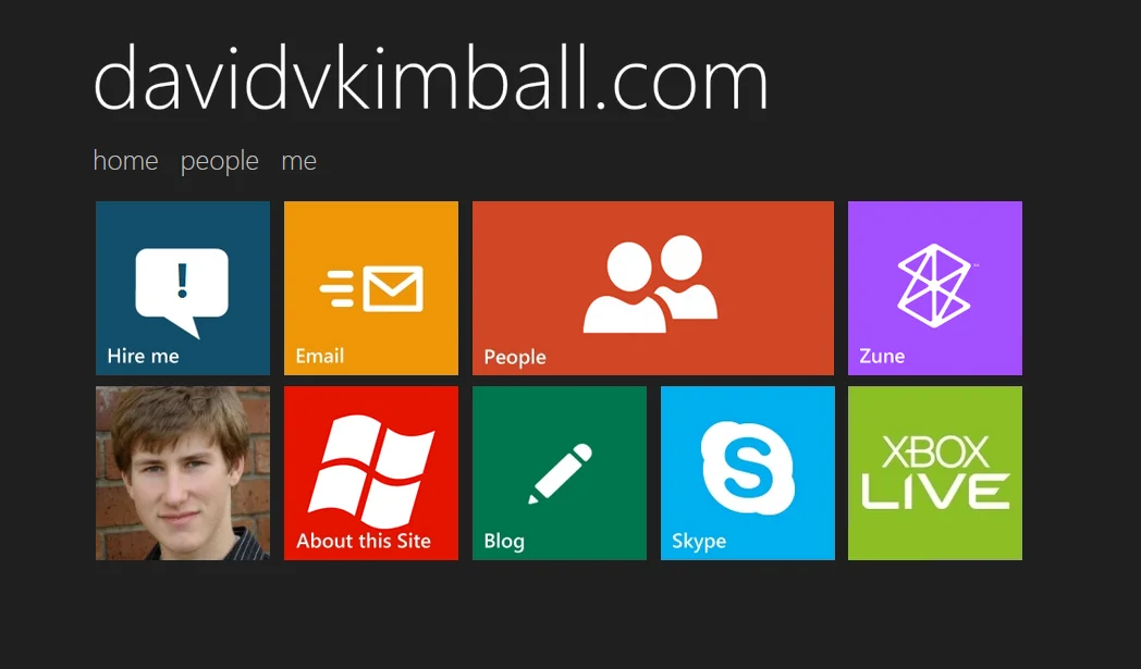
Metro-Inspired
I was very into what Microsoft was doing around that time particularly with Windows Phone and their other consumer products, so I modeled my website after the Metro UI design language.
My blog was hosted on Tumblr, and initially separate.
I refined the Weebly site over the years, by 2015 I had multiple custom animated GIF images with glow animations for the live tile-based design and a merged the blog into it. I was still grandfathered into their free plan with a custom domain name.
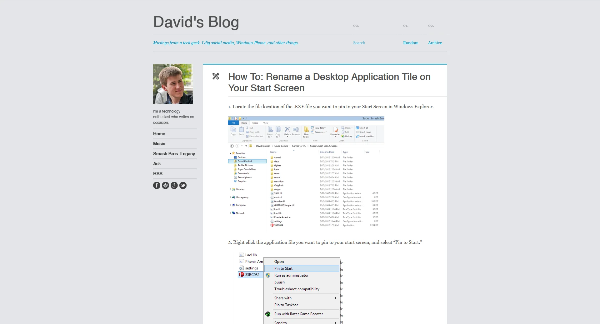
I made an over-the-top intro trailer for it for fun.
Beyond Metro
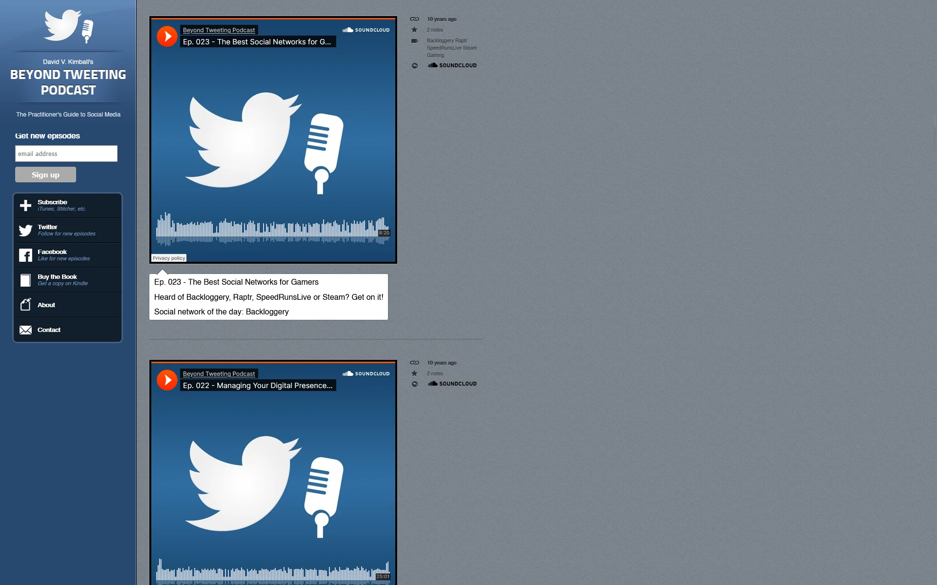
I had published a book on Twitter and started a podcast about social media, which led me to create a custom website using Tumblr. Why? The service also let you use a custom domain name for free, so I used that for the Beyond Tweeting Podcast site. It was a natural fit for blog posts that had SoundCloud podcast episode embeds in them.
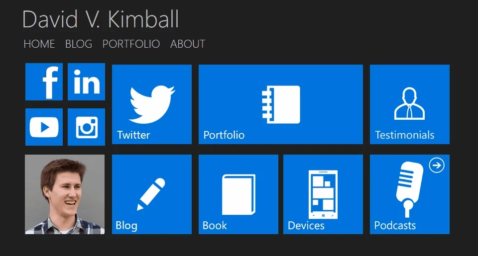
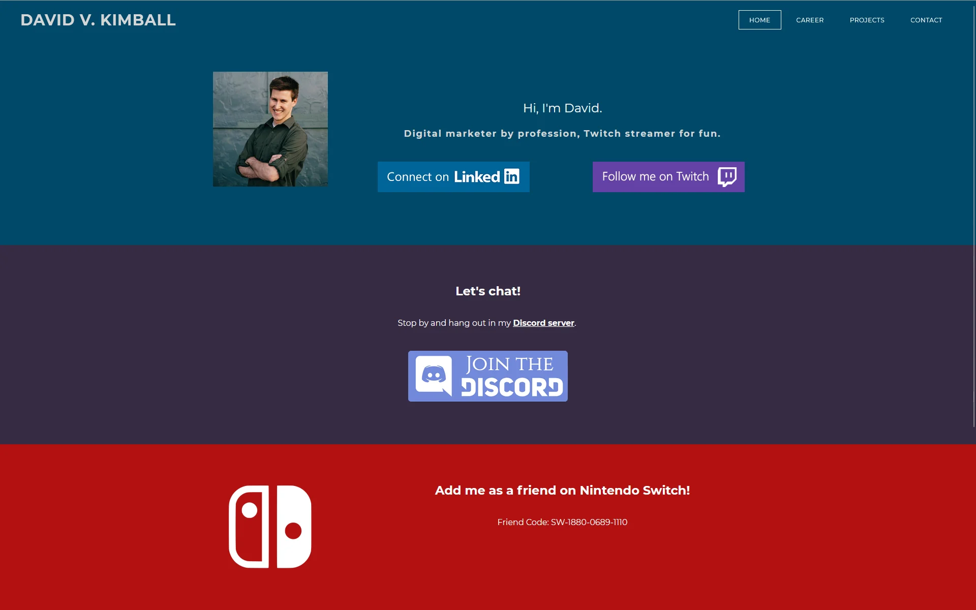
Finally I attempted to go a different design direction and go for a more independent look in 2017. I was leaning more into my Twitch stream and professional platform on LinkedIn. Still on Weebly.
Moving to Static Site Generators
By 2021, I discovered the best free option to creating a custom website and went for it. I found a free HTML5 theme and published it hosting on GitHub and deploying with Netlify.
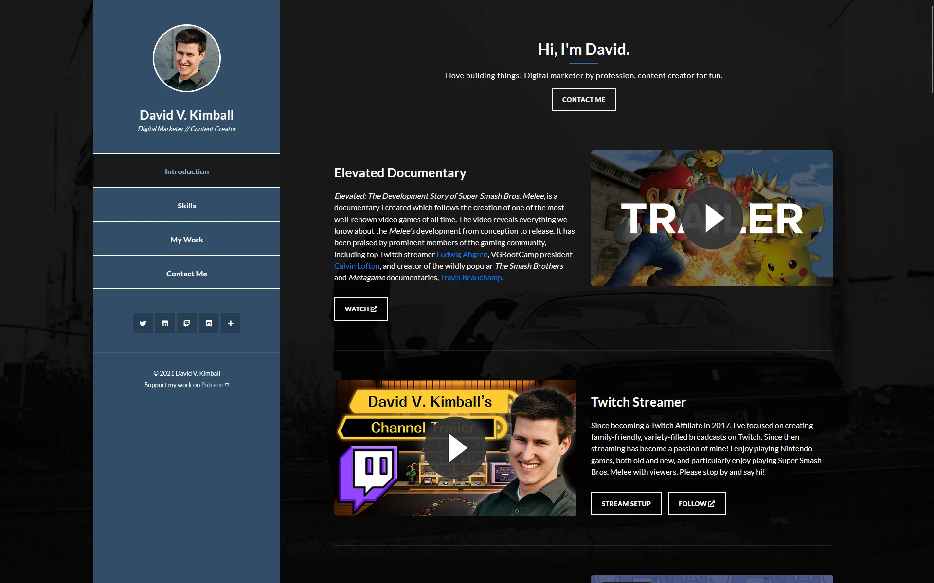
At this point I was fairly involved with the Super Smash Bros. community and had created a documentary covering the development of Super Smash Bros. Melee, among other things. So it was a central focus of my content on YouTube and in other places.
However, I couldn’t merge the blog because it was too difficult for me to figure out how to do with static site generators at the time and use them with the theme I wanted. So I created a separate blog using Gatsby with the help of a friend.
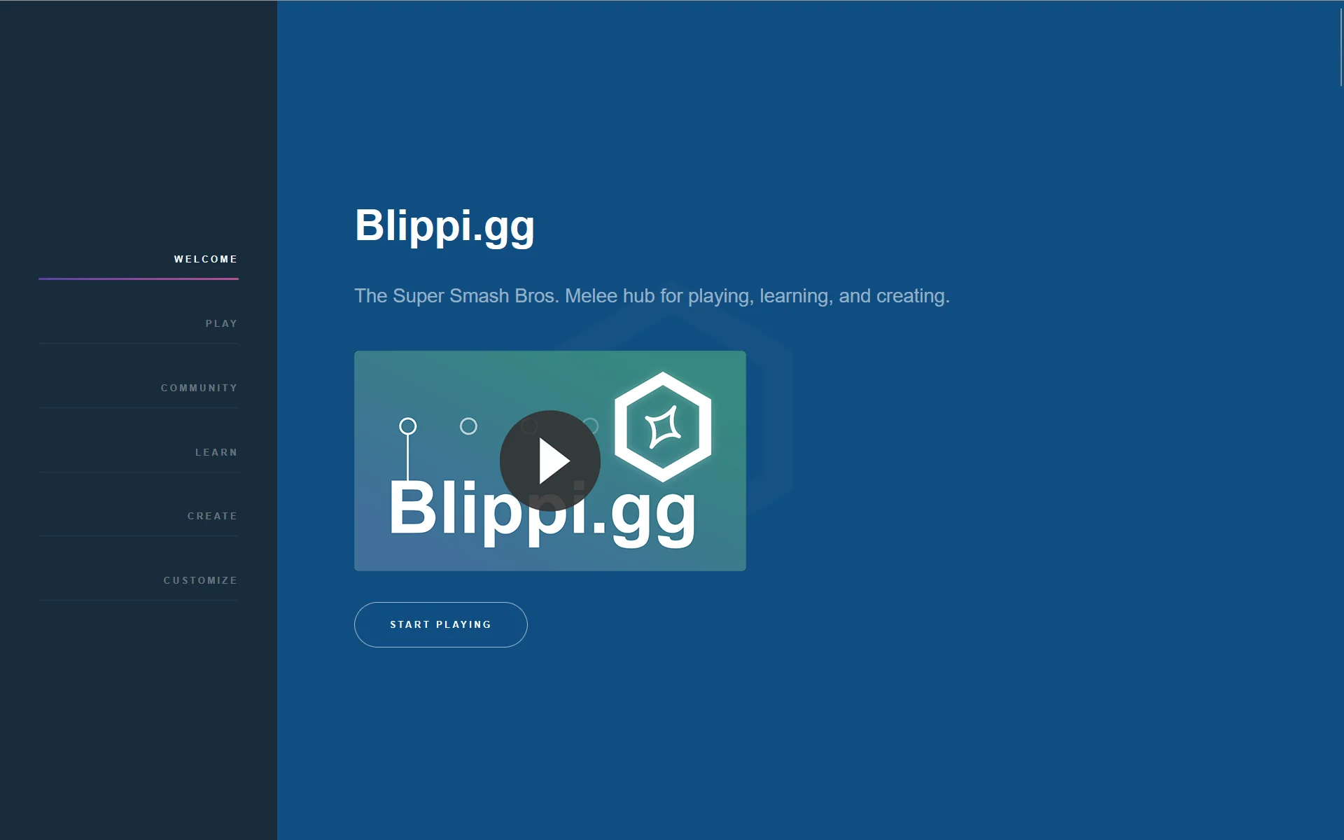
I had also created Blippi.gg (now melee.tv) which furthered my comfort level in custom websites, using a template from HTML5 UP.
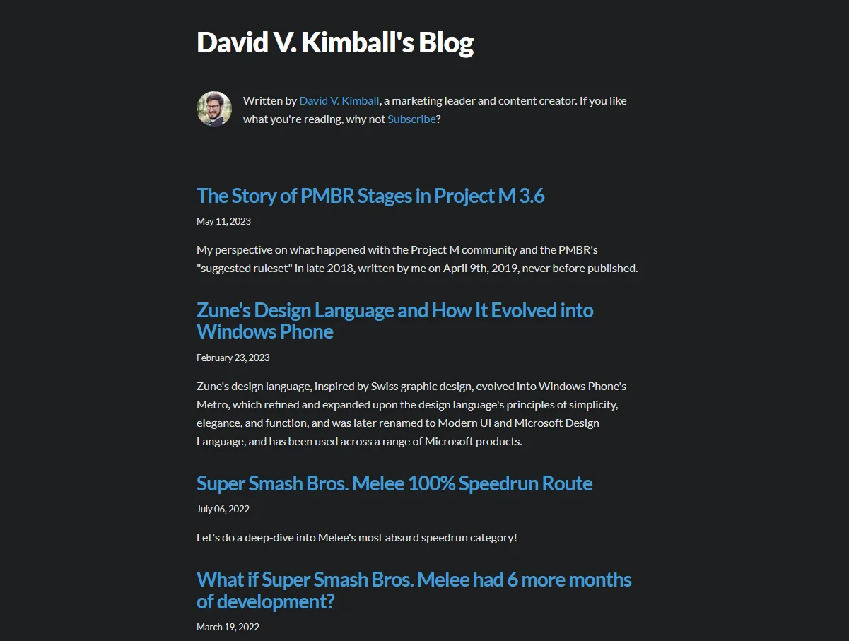
In 2023 I purchased a new website theme and tweaked it to add a dark/light mode toggle. I decided to migrate my blog to Hashnode since I enjoyed the user experience and I could use a custom domain name for no charge.
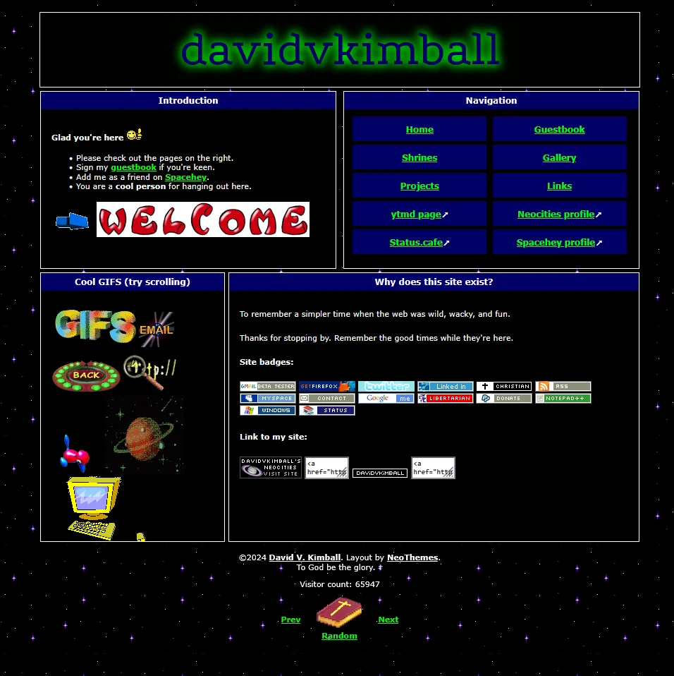
Discovering the Indie Web
Around this time, I started experimenting with creating other websites, and discovered the indie web, a quietly growing network of small, distinctive websites that mimicked the feeling of the 90s and 2000s internet.
So in the spirit of fun, I created a Neocities website. It felt a lot like the first website I made in 2006.
Then I created create.dvdv.kim (formerly david.qa). This was a site that helped users create websites, specifically allowing them to blend the retro/indie web aesthetic with the modern static site generator tool options.
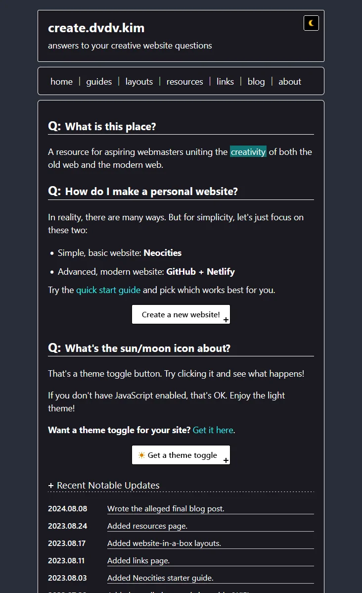
Something that kept me coming back to these alternative sites was their simplicity. They didn’t demand a full-screen width or over-the-top animations. They were simpler and more focused.
The biggest pain was updating dynamic blog content. You had to update the HTML files manually, and that got tedious quickly. There was some enjoyment in the process, but I’d much rather spend my time getting ideas and resources out there, not updating “previous” and “next” blog UI links every time I wanted to post.
Discovering Astro
In mid-2024 I was casually browsing new website / blog themes on GitHub and stumbled upon Fuwari. It used Astro which I hadn’t heard of before. It was a bit of a learning curve at first, but quickly I adapted to it.
Then I realized the content were comprised of Markdown files on my PC. So I tired opening the content folder with Obsidian. And it worked.
Using the git-based workflow, Astro, and Obsidian together felt amazing. I just had to tweak the theme a little bit so that it “just worked” and after I went back and forth with ChatGPT, I was able to get them all to work together seamlessly.
This started an obsession with Astro sites and themes - I was blown away by how speedy and performant they were. This lead me down a rabbit trail of discovering new site designs and frameworks I wanted to try.
So I created an experimental, daily blog called david.qa using the Chiri Astro theme.
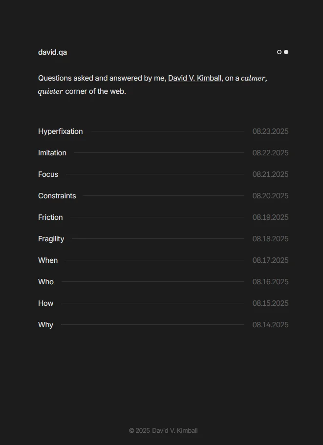
I was enthralled by how minimal it was. It was so focused. Every detail showed up. There were no superfluous elements. Everything in the design served a purpose.
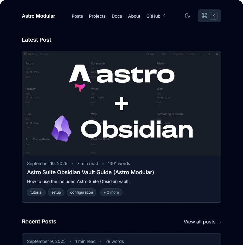
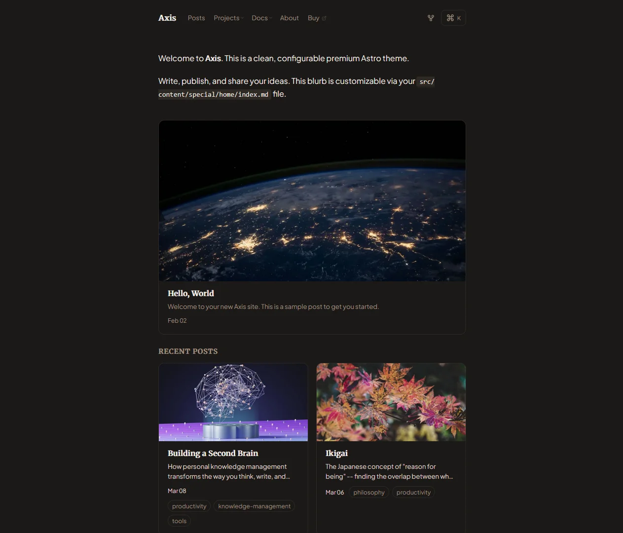
I wanted to try my hand at making my own custom Astro theme - so I began with Astro Modular. I wanted to for something “optionally” minimal; users could get a decked-out, feature-packed experience or a totally-stripped down design.
Here’s how it looked when all of the features were enabled on the homepage:
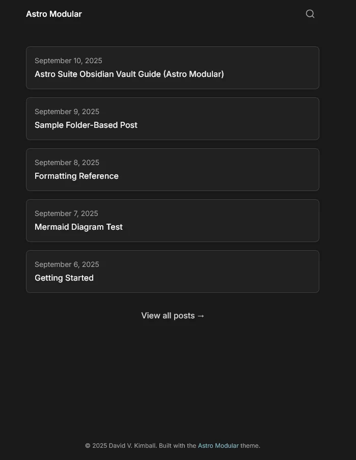
The same theme, but just with most of the elements stripped out a different color palette:
In parallel, I was developing Vault CMS. I codified the workflow I was utilizing to use Obsidian and Astro together into a formal content management system, consisting of various plugins an an opinionated Obsidian vault of configurations.
Astro Modular served as the perfect use case for it working well. It was fun to work on, and it quickly gained momentum.
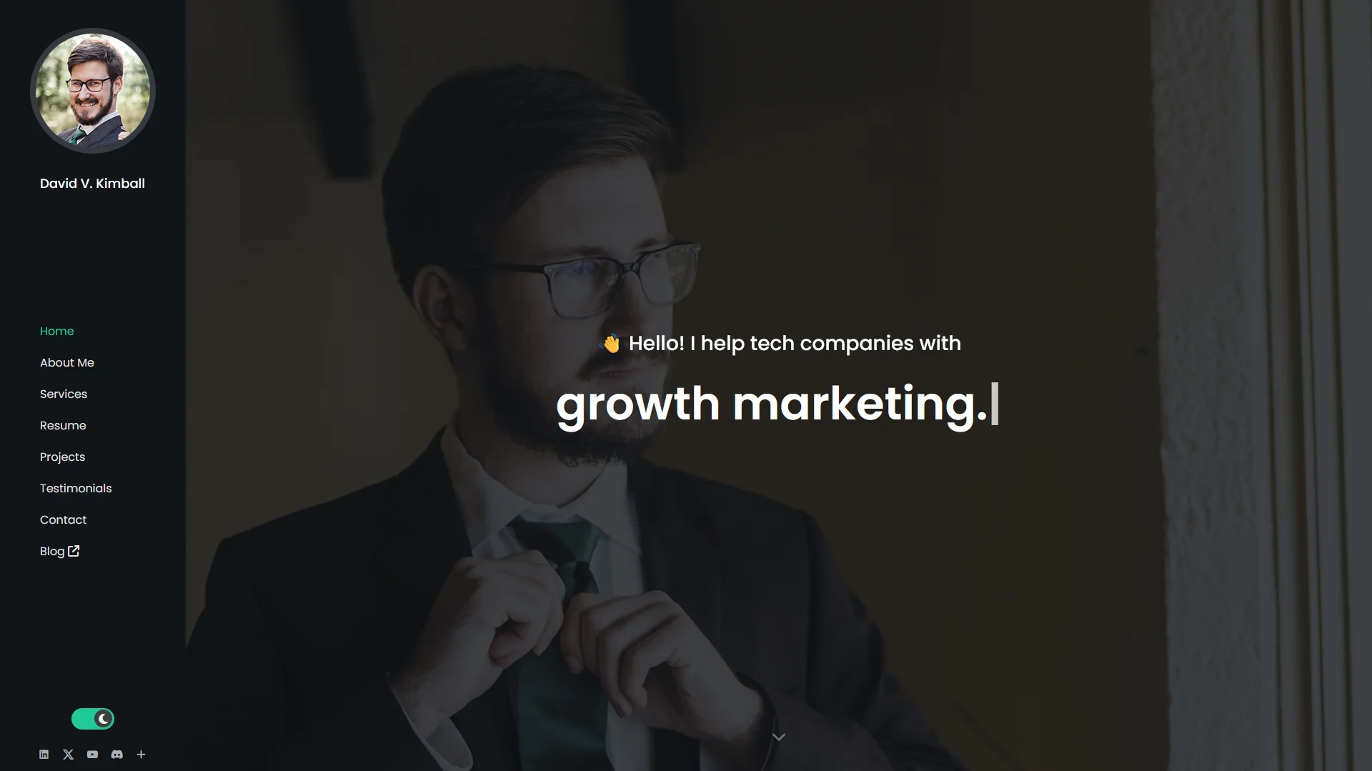
2026 Design
After publishing Vault CMS documentation via the Starlight theme, I was ready to remake my personal website with all of the knowledge I had acquired.
And that’s the website you see today.
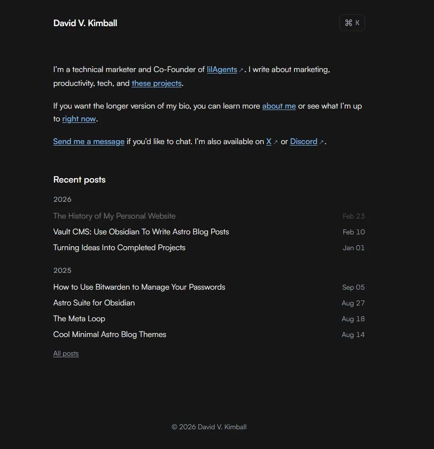
You’ll notice in that screenshot, the this blog post’s title is faded out. That’s because it’s a draft and I’m writing it right now. It’s an example of the little features I’m able to add - like when using pnpm dev, let draft posts not show up in production, but show faded while testing locally.
Design Philosophy
I didn’t merely want something minimal, I wanted something focused.
Over the years I’ve gradually acclimated to a particular workflow where I’ve actively simplified the software I use by reducing it to just the functions I’d use. I’ve also become a lot more keyboard-centric relying on even more keyboard shortcuts, macros, and keyboard layers than I have in previous years.
As a fan of the Metro UI design language, I appreciate the content, not chrome philosophy. The content itself can be the design. You don’t necessarily need to add in extra shiny buttons of flashy elements for their own sake.
The command palette is another feature born from these ideas. You can open it by pressing CMD / CTRL + K. You can instantly start typing and get results. Pressing TAB will let you cycle through the options of posts, pages, and social links, while using the arrow keys lets you move between results, and hitting Enter opens the highlighted result. It’s so snappy and satisfying to use.
When you open a new page on the site, elements float in elegantly. It’s snappy enough so you’re not waiting for an animation to finish, subtle enough to maybe not even notice it, but enough to where it adds that bit of polish to the experience.
I’ve added icons throughout, added an optional updated date for pages and posts, added a fun easter egg page, and more. Not to mention the fact that it works perfectly with Vault CMS and even has a few custom Obsidian plugins made specifically for it that I haven’t released publicly. 👀
Effectively I can effortlessly link between posts, pages, and other content in Obsidian, all using the native features like you would for taking notes, and it “just works” when translated to Astro. I don’t have to edit relative links or fix Obsidian extended Markdown syntax to conform or work for Astro, it just works. Graph view, backlinks, properties work as you’d expect and translate perfectly in a way Astro understands them, too.
Here’s a view where you can see me testing locally directly within Obsidian. I’m using the Terminal community plugin and the web view core plugin to do that.
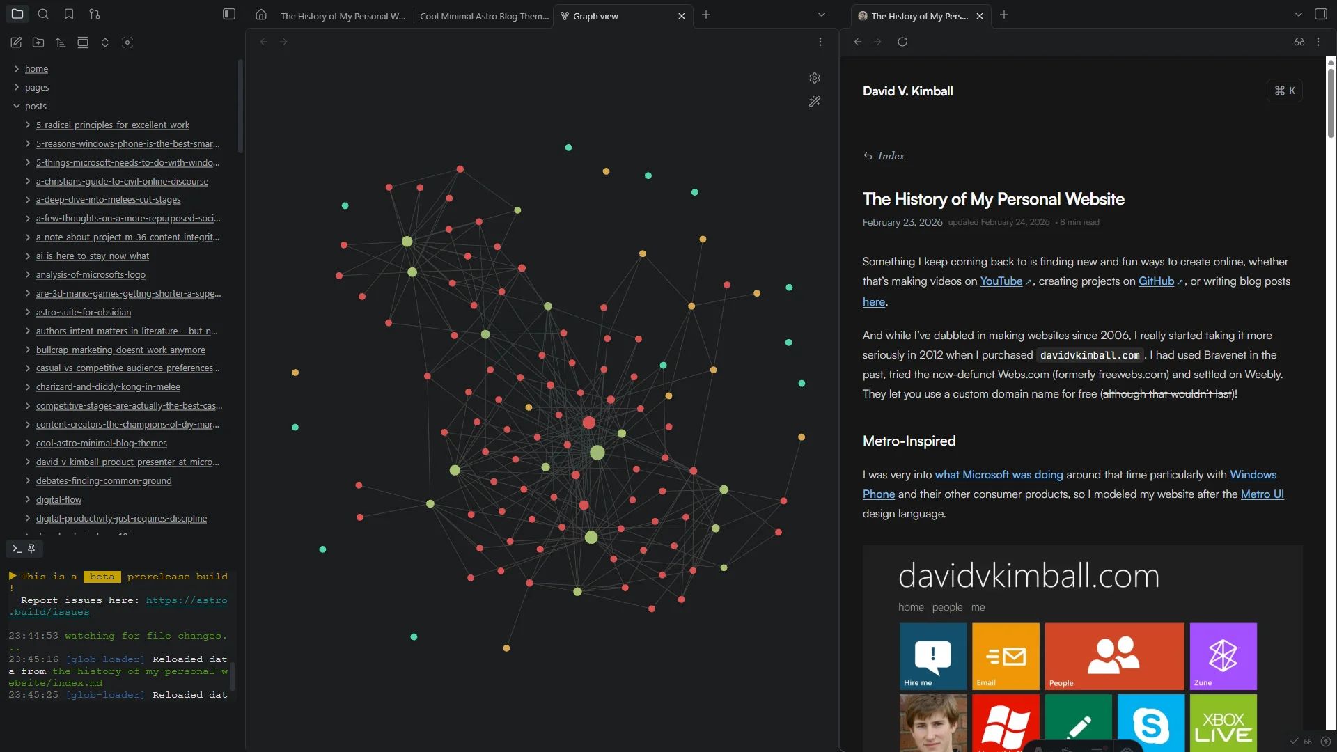
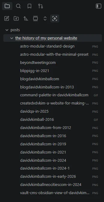
In the center you can see the graph view, with all of my posts and pages connected via links and tags. On the left you can see I’m using Folder Notes where index.md is the content I’m writing, and all of the images and other assets are within that folder. Keeps things more organized as you can see here:
Using This Theme
If you’d like to use a version of this theme yourself, it’s available here as the Axis theme.
Design Inspiration
These are the websites where I gained inspiration:
- Paco Coursey
- Lee Robinson
- Knut Melvær
- Emil Kowalski
- Erudite
- Zaduma
- Astro Micro
- Steph Ango
- Chiri (as mentioned earlier)
What’s Next
I’m not naive enough to think I won’t change my site design again in the future. But for now, I love my current design. Some may consider it aggressively minimal, but I find it to be perfect. Expect additional tweaks, maybe a few more pages, and definitely new blog posts coming. You can always subscribe to get new updates monthly.
Oh, also, zero AI was used in composing this blog post. Not sure if that’s valuable information to anyone or not, but worth mentioning for my own sake, when I use AI for so much now.
As always, thank you for reading!