Windows 11: What Needs to Change Before Release

As of July, Windows 11 has been available to test as a preview release to anyone included in the Windows Insider Program. While it’s in its earliest stages, we don’t know for sure how much will really change from now until launch, other than the biggest news items like Android apps coming to Windows 11. So for now I’m assuming the Windows 11 we have now will look a lot like the one that’s released for this year’s holiday season — hopefully with some bugs squashed and performance improvements.
Generally speaking, there’s as lot I like about Windows 11 so far. Although right now, it feels mostly like a newly designed Windows 10. I love the new interface, sounds, etc that contributes to the new UX, but feature wise it doesn’t feel much different than Windows 10. While some nice quality of life changes like more flexible window snapping and virtual desktop management are nice adds, there a few odd things about the OS right now.
So let’s talk about what things in Windows 11 should be changed.
Windows 11 Needs Some UI / UX Uniformity

Finding other “universal” visual changes to design like what they’ve done with rounded corners and keeping them as consistent as possible. Here are some examples:
- Right click context menu: designing a right click context menu that accommodates the modern design but doesn’t remove any of the old functionality. I know one difficulty here is lots of Windows programs shove in their own right click context menu items into the right click and junk it up. But maybe creating a design system that works around these obstacles.
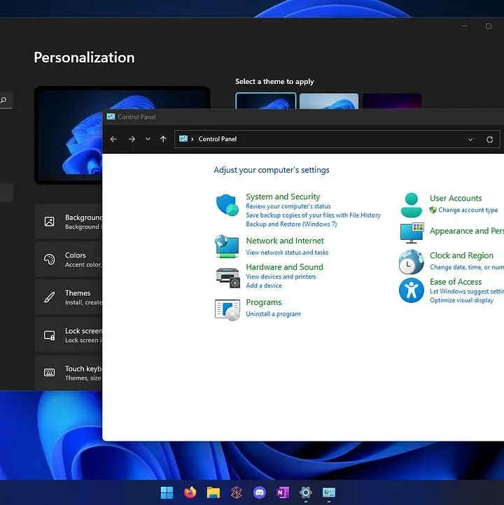
- True, universal dark theme: a dark theme that extends not only from Explorer and the taskbar but actually modifies legacy Windows applications as well, as mentioned earlier in this thread.
- System icon audit and replacement: the Windows team needs to go into the .dll files of their core system and update any icons that aren’t brought up to Fluent Design standards. There are so many legacy Windows icons still part of Windows 11 it’s baffling to me.
- Task Manager, Resource Monitor, and other programs of that ilk: why does it still look so dated? Bring these out of the Windows 7 age please!
- Figure out what to do about Control Panel and be consistent: I love using Control Panel but only because it feels the most complete, especially compared to the Settings apps in Windows 8.1 and Windows 10, but with Windows 11 they have an opportunity to fully replace it. However, there continues to be things you can only do in Control Panel, while they ALSO straight up remove items from Control Panel (like Windows update). I don’t like having to switch between two settings applications all of the time. It’s clunky and makes no sense. I say just put everything in the new Settings app, and then have a “God Mode” option that makes it appear in a huge list like IT pros want.
Windows 11 Needs More Customization Options

While I am thankful for the customization options available in Windows 11 today, there are some tweaks to my system I want to make without having to use Winaero Tweaker or some other third party app.
- Ability to remove ads & suggestions: I understand why Microsoft doesn’t make this easy, but I want to remove anything remotely intrusive from my Windows experience, and annoying suggestions from things I don’t care about takes the cake as the main thing I don’t want.
- Better Start Menu customization: I’d like to modify my Start menu to remove the search bar, remove suggested section, and have folders akin to a smartphone app drawer design.
- Ability to create custom shell folders: I might be the only person on the planet that cares about this, but I’d love for the ability to create custom shell folders easily. For example, being able to place a folder into my Users folder and have its location be pointed elsewhere, like on a different drive on my PC. I know what I want can roughly be accomplished with folder shortcuts or libraries, but I find those experiences to be clunkier than just using a shell folder approach.
- Uninstall all bloatware: there are just some Windows 11 apps I don’t want and will never want, and I want to have the ability to remove them. For example: Cortana, Maps, Video Editor, Xbox Game Bar, etc. Why can I uninstall Windows Terminal, Paint, and Calculator but not Cortana or Xbox Game Bar?! It makes no sense.
- Animated desktop backgrounds: I don’t know why Windows still doesn’t have native animated/video wallpapers as an option. I’ll continue to use Wallpaper Engine if I want to do this for now.
- Stop forcing defaults and also make setting default programs easier: a huge turn off from using the Widgets or Windows built-in search is how they force you to use Microsoft Edge or Bing. Most consumers won’t ever change this, just give techies a choice. I want links to open in Firefox and searches to be done in Google. Also, setting your default browser in Windows 11 is somehow even more of a pain than it was in Windows 10 or 8.1. Just make it easy to pick the program/app you want to use, and let me click “set as default for everything.”
Windows 11’s New Feature Set Could Be Improved

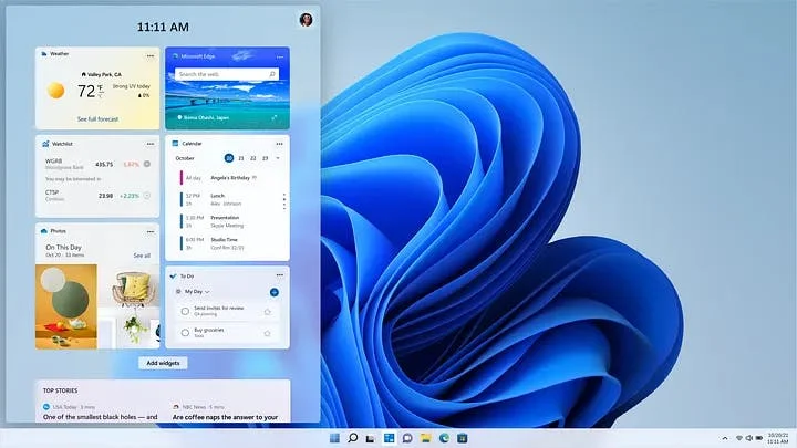
- The Widget Panel: widgets are extremely lacking in my opinion. I’d love for this to be the “live tiles replacement” it’s trying to be, but right now it has very little that’s compelling. 99% of the news sources from the “interests” I select are irrelevant and there’s not a good way to really customize them to just the sources or topics I care about. We live in a world of niches, I’d like to apply a custom set of sources to get meaningful information to me. Weather is one thing, but “Esports” being news about every competitive video game on the planet makes me not want to use it at all.
- Improved calendar app on taskbar: I live and breath my Google calendar, and I’m delighted it integrates in the Windows 11 Calendar app. So why can’t I get more meaningful connections to it on the taskbar calendar? In Windows 10 it showed more relevant agenda info, and they took that away with 11.
- Microsoft Teams is a weird choice: I get they want to compete with Zoom, but having Microsoft Teams baked into Windows as a replacement for FaceTime or Facebook Messenger just seems like a strange move. Thankfully they’re switching from Electron to ReactJS so this new Teams client will be significantly less of a resource hog than the Teams app you might be using today, but despite the improvements I can’t help but think about how they put Skype and Lync in the grave, and wonder if this will be any different. Unlike popular voice/video/text chat clients like Discord, I anticipate Teams will have a tougher time breaking into the consumer market, as its considered more of a Slack competitor within the business realm.
- Improved partitioning compatibility and feature set: something Windows could really benefit from is some superior partitioning native tools and also just being able to work with more hard drive formats. This is more nebulous but it is a continual annoyance for me.
- See more specific PC info: being able to view more advanced PC info, like how hot my CPU is running (akin to Resource Monitor). Should all be visible in System. I shouldn’t have to use third party apps like Speccy to get that information.
- Ownership issues: I don’t know why even as an admin of my own machine I always have to specify that I have permission to access folders like WindowsApps. The way permissions are setup sometimes in Windows makes no sense.
Minor Windows 11 Gripes
- I want a Task Manager shortcut when I right click the taskbar still. I know I can use CTRL+SHIFT+ESC, but still.
- I want to be able to easily hide my Microsoft account email address in Windows settings when I do screenshares and such. It’s annoying that it always has to be visible in Settings.
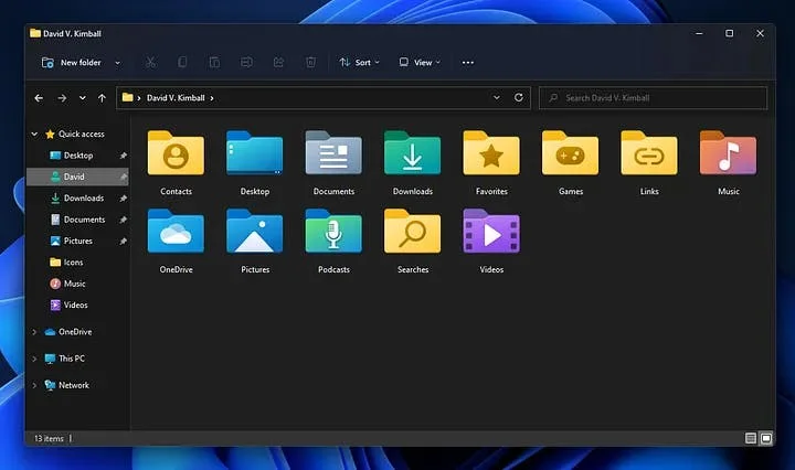
- I wish the folder icons for Favorites, Games, Contacts, Links, and Searches all kept their unique folder icons instead of transitioning to normal folder icons 64px and lower.
- I never want “Quick Access” to my default page in File Explorer. I’d much rather it be my User folder or This PC.
- I want to pick what appears on the left panel in File Explorer. For example removing OneDrive or adding a Project folder that I’d like to be able to expand and collapse.
Conclusion
Assuming your PC can even run Windows 11, there’s some nice quality of life changes to look forward to. However there there are a good number of tweaks I personally hope to see as Windows 11 continues to receive updates in beta or see included in the fully shipped product post-release.
Are you using Windows 11 early? What do you think of it so far? Throw me a response with your thoughts.