Super Smash Bros. Melee Twitch Stream Overlay Tour
Background
I’ve been streaming on Twitch for 10 years now, and my stream setup has gone through a lot of change in that time - and so has my overlay design.
I decided to create a video that goes through each element of it, and I wanted to do a more detailed write-up as well. So here we are!
To get everything to work, I use OBS Studio with StreamElements (SE.Live), MixItUp stream bot, a Stream Deck XL, and a GoXLR Mini audio interface. I may go over my stream setup in more detail in a future post.
Video Tour
The first ~2 minutes or so cover the opening sequence (“stream starting soon” screen), followed by the camera scene, gameplay scene, alerts, standby scene (or “BRB” screen), and finally the credits sequence.
Opening Scene
For the whole sequence to function properly, I use a Stream Deck multi-action function key to automate it. It mutes my mic, sets it to the right scene, reloads my StreamElements overlays, launches the correct music, and activates the right OBS sources at the perfect times.
Visually, it is inspired by the beginning of Melee’s Adventure Mode.
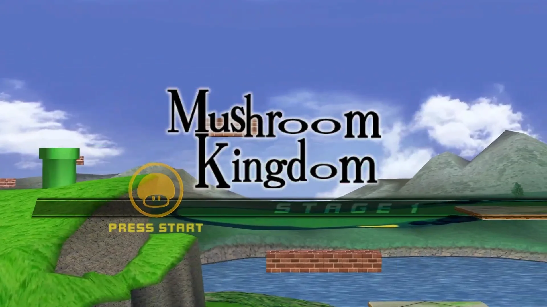
Instead of saying “Stage 1” the message says “Stream Starting Soon” in typical Twitch opening scene fashion.
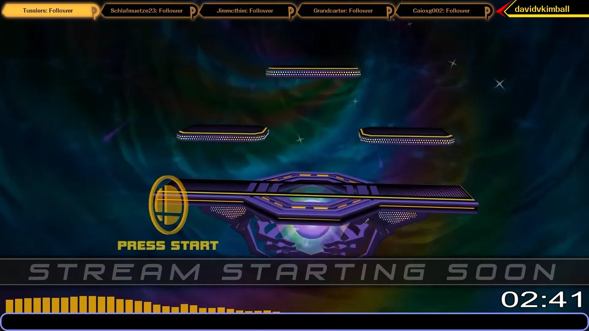
Huge thanks to Cjag for helping with codes to make this work properly in-game, and also creating the custom Yoshi’s series emblem model that appears during the Yoshi’s Story stage that doesn’t normally ever appear in Melee.
A keen eye may also notice the cell-shaded design of Melee’s stages in the opening scene - this is Animelee, an aesthetic mod of Melee I’ve covered extensively. Definitely worth checking out if you’re interested.
A few other details to point out here - the timer on the bottom right uses the same font as Melee’s in-game timer - SchulbuchNord Normal. I’ve increased it’s scale horizontally to match as well.
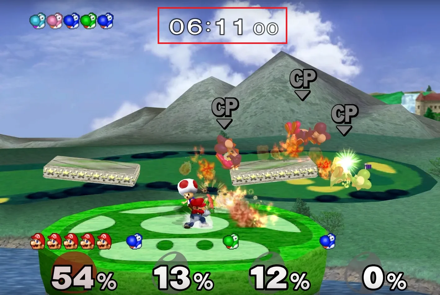
For the timer to function, I use OBS Studio’s countdown.lua script.
You can see the audio visualizer responding to the music also. No directly Melee inspiration, but I did use the same yellow as the main menu item colors from the game. For this I used Waveform Visualizer.
For the countdown, I have re-created the “5, 4, 3, 2, 1” visual sequence using the same in-game font at a high resolution.
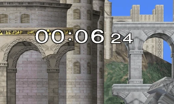
The audio of the countdown come directly from voice actor Dean Harrington’s voice lines from the game.
Overlay
There are several elements that comprise the overlay itself, so let’s go through them each.
Stinger Transition
A stinger transition is a type of animated video which combines transparent video animations into a full-screen overlay using a timed cut to create a visual transition. This may look familiar to you if you’ve watched any of my YouTube videos.
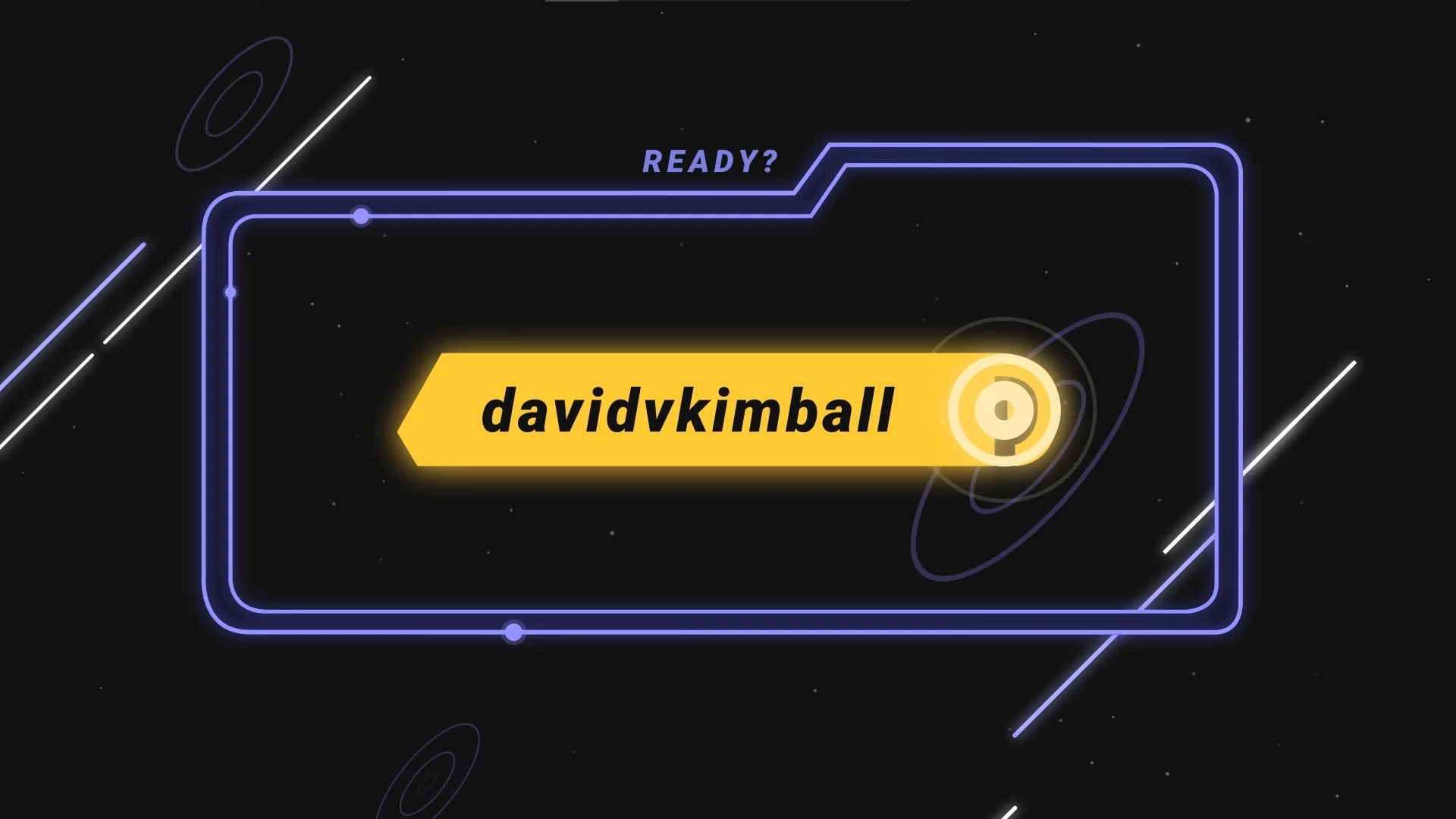
The design is heavily inspired by the menus of Melee, which you’ll find is a common theme here.
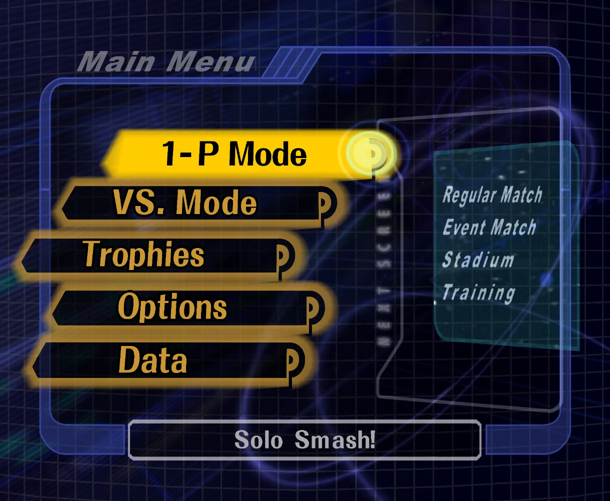
Event List
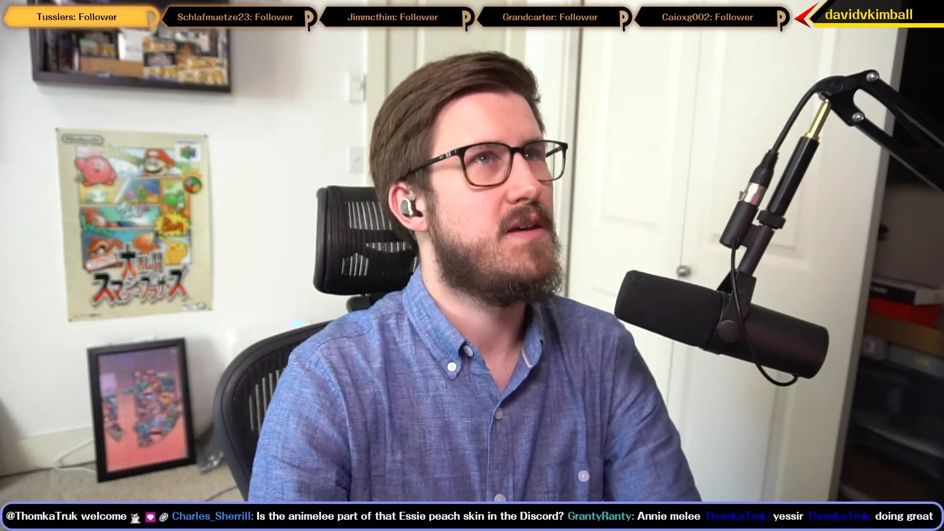
Speaking of the main menu items, you can also see them appearing as the “Event list” at the top of my screen. It basically shows, in order, the most recent stream events that have occurred. For example, the latest follower, resubscriber, tipper, etc.

This was custom built when I commissioned tryptech to build it. I recommend his services if you’re looking for custom overlay widgets or elements.
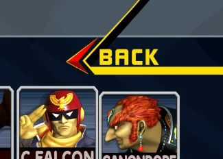
On the top right I just have a small button with my username which is inspired by the “back” button on Melee’s character selection screen.
Chat
Along the bottom you can see a minimal horizontal chat. Over the years I realized the utility of having chat on-screen is more of a visual indicator for stream viewers than anything else, so giving it a slim part of screen real estate made the most sense. For this I am using Minimal Chat by MrBoost.

While sharing my desktop, what works out very well is that the Events List covers the menu bar of the active window and the chat covers the Taskbar, both fairly unnecessary to show to the viewer.
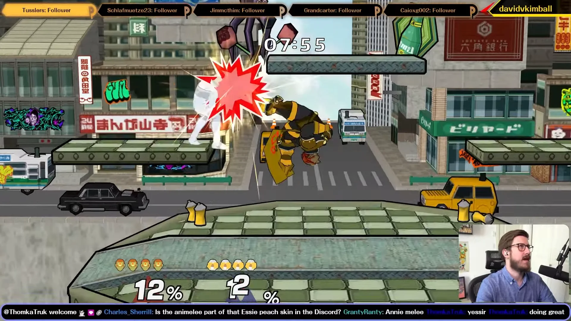
Camera
Pictured above, you can see that my camera appears on the bottom right during my gameplay scene, and I give it a certain width and height to make it easy to move to another corner of the screen if needed. I can easily resize it or toggle it on or off, but I reserve the right-center section for stream alerts.
Alerts
For each alert, again I wanted to reference something from Melee.
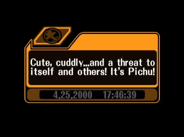
Melee’s in-game notices were an obvious choice, so I went with those as a catch-all for bits, tips, and merchandise purchases, using a custom icon on the top left to differentiate each one visually.
Tip Alert
Anyone who tips via my tip page will be featured with their name and amount.

Each notice-based alert was recreated in CSS and JS by tryptech.
Bits Alert
Every bit alert gets a custom animated bits graphic depending on the type of bits cheered.

Merch Alert
Anyone who buys an item from my merch store will get a shout out on stream. Here’s what it looks like.

Follower Alert
For new followers, I wanted to reference the “Got it!” animation from the trophy lottery.
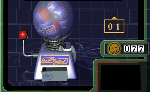
For the alert, I used “New Follower!” as the text and the username of the new follower in the black box. This was another tryptech commission.

Subscriber Alert
For a subscriber alert, I wanted it to mimic the single player mode stage clear screen and play the same fanfare.
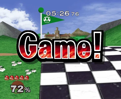
Depending on the number of resub months, I would tweak it visually slightly by color. It would play one of the two fanfares randomly.

Patron Alert
For Patreon, it gets its own unique alert from the Patreon StreamElements widget, which I was able to skin to give it a Melee theme as well.

Raid Alert
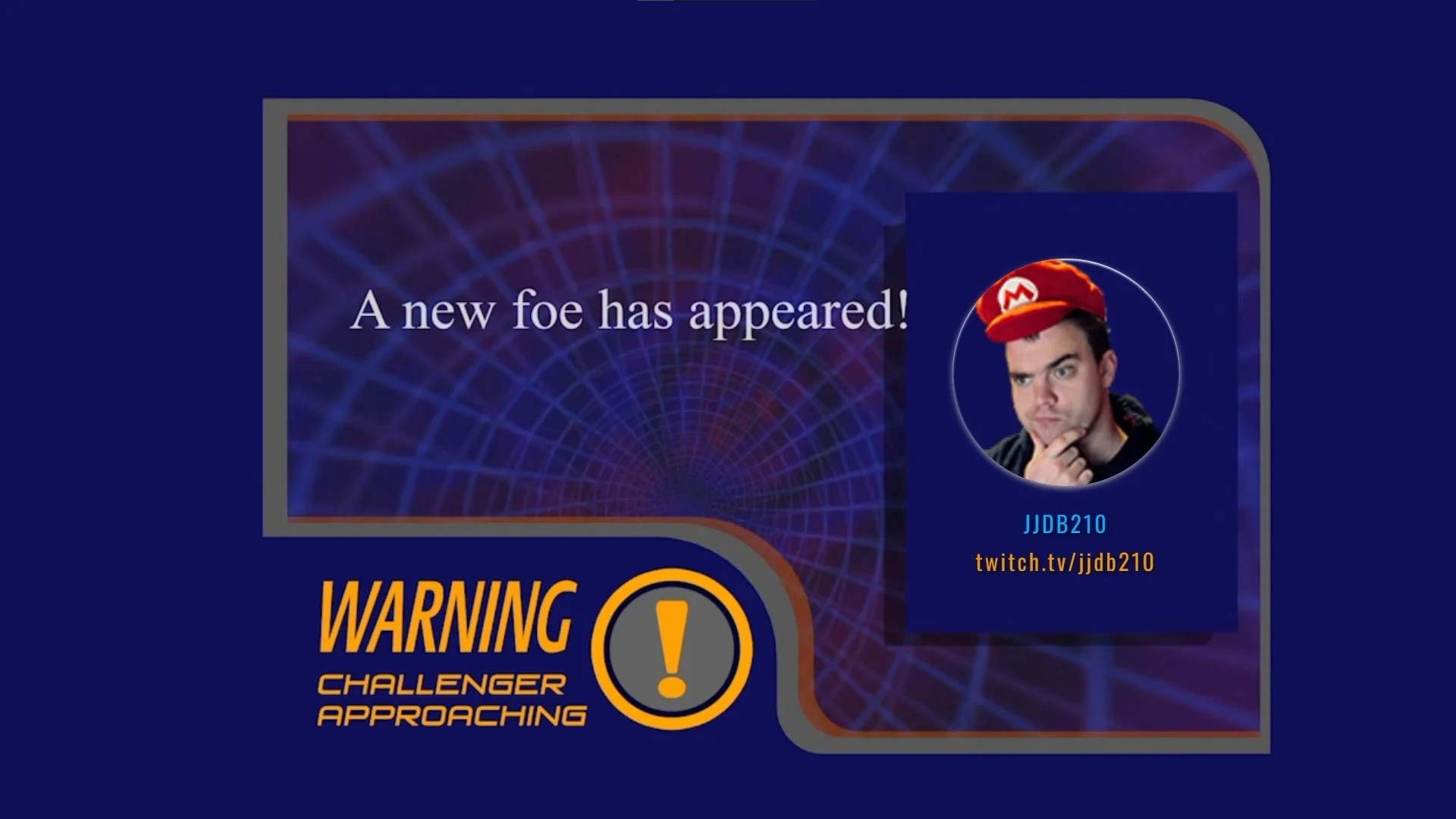
For raids I decided to borrow from Melee’s “Challenger Approaching” theme, as if a streamer who raided me was a new character to be unlocked.
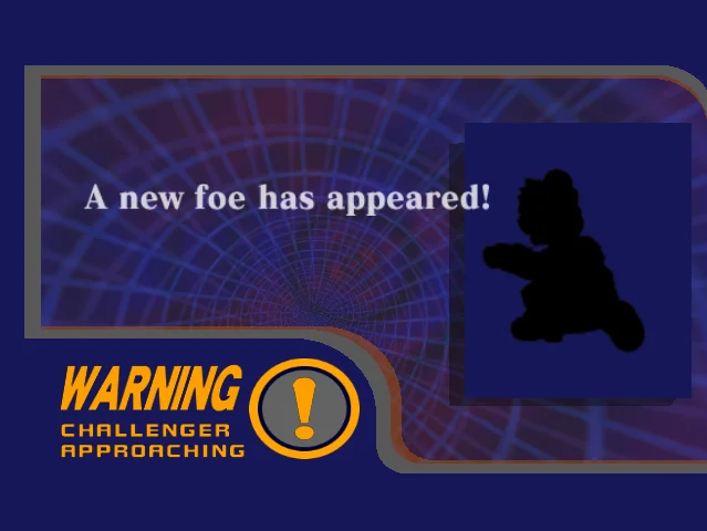
The automated raid alert looks like this.

I’ve also got an optional full-screen takeover version as well which can pop up if I hit a Stream Deck key. The raider will also get a shout out.
Standby Scene
Often referred to as a “BRB” (be right back) scene, the standby scene is helpful for when I step away for a moment. For this I wanted to use the “Continue?” screen when you lose a stage in the single player modes.
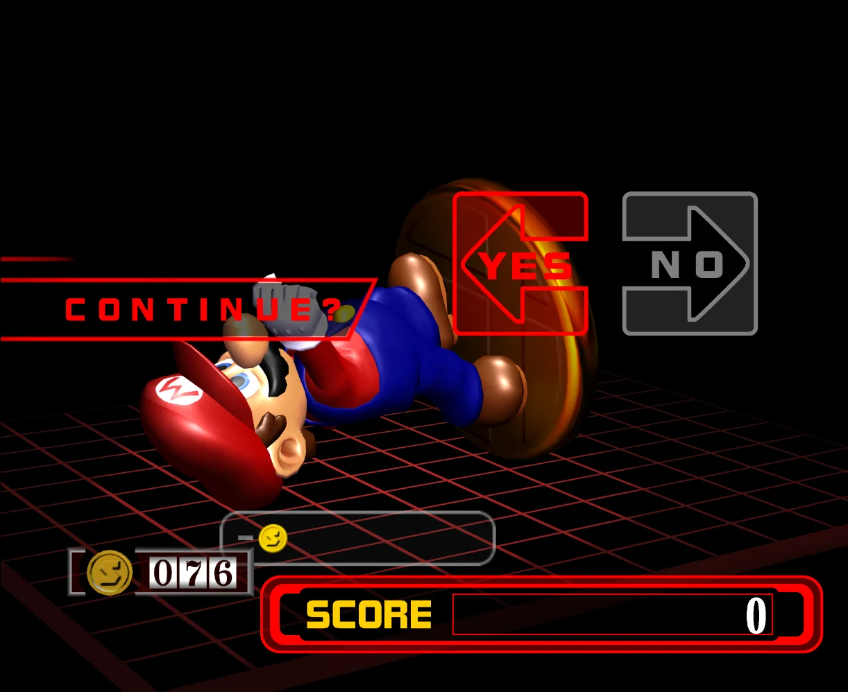
I also wanted something more visually interesting than just one trophy, so I instead have it cycle through each character’s trophy. Mostly I use the classic mode trophy, but sometimes I use the Adventure mode trophy, like in the case of Fox, Falco, Ice Climbers, and Mr. Game & Watch.
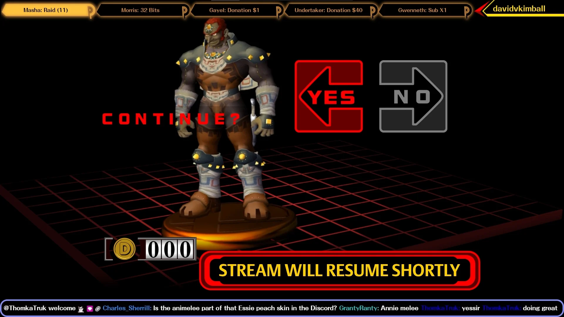
To achieve this I chose a different camera angle in-game using Dolphin’s free look feature and green screened out the background. Then I layered it on top of the background and put the other HUD elements on top of it as well.
I don’t show it off in the tour video, but the coin counter dial can also be modified via chat commands by VIPs and subscribers.
Credits Scene
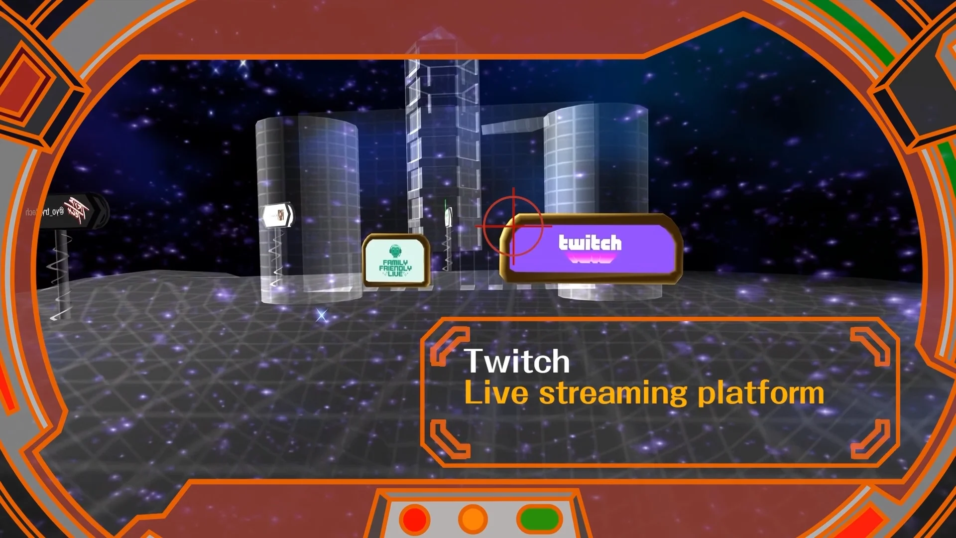
To end things off, what a more appropriate option than to use the credits scene from Melee directly and repurpose it?
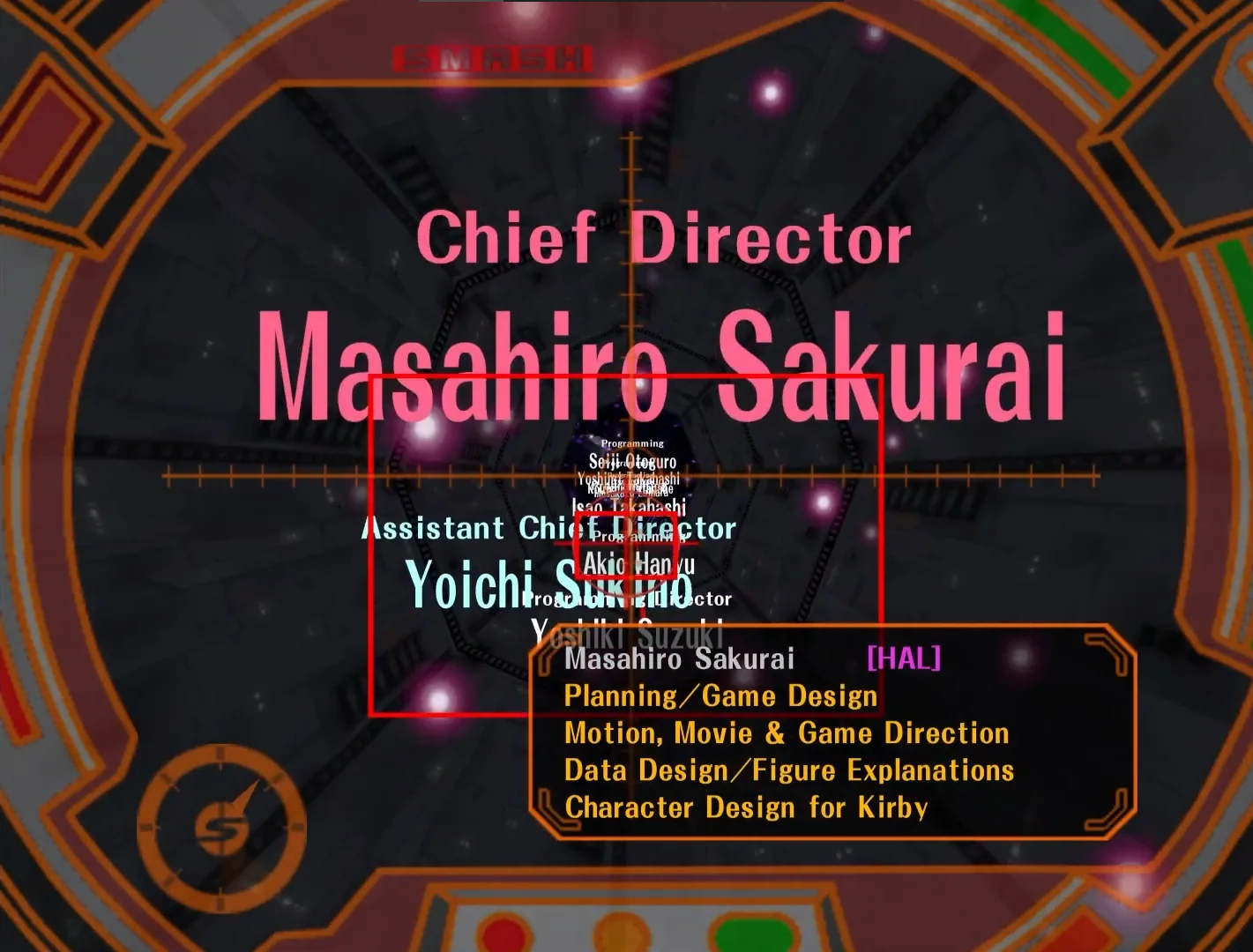
For the accompanying music, I use the main menu theme from the medley piece on the Smashing… Live! orchestrated original soundtrack.
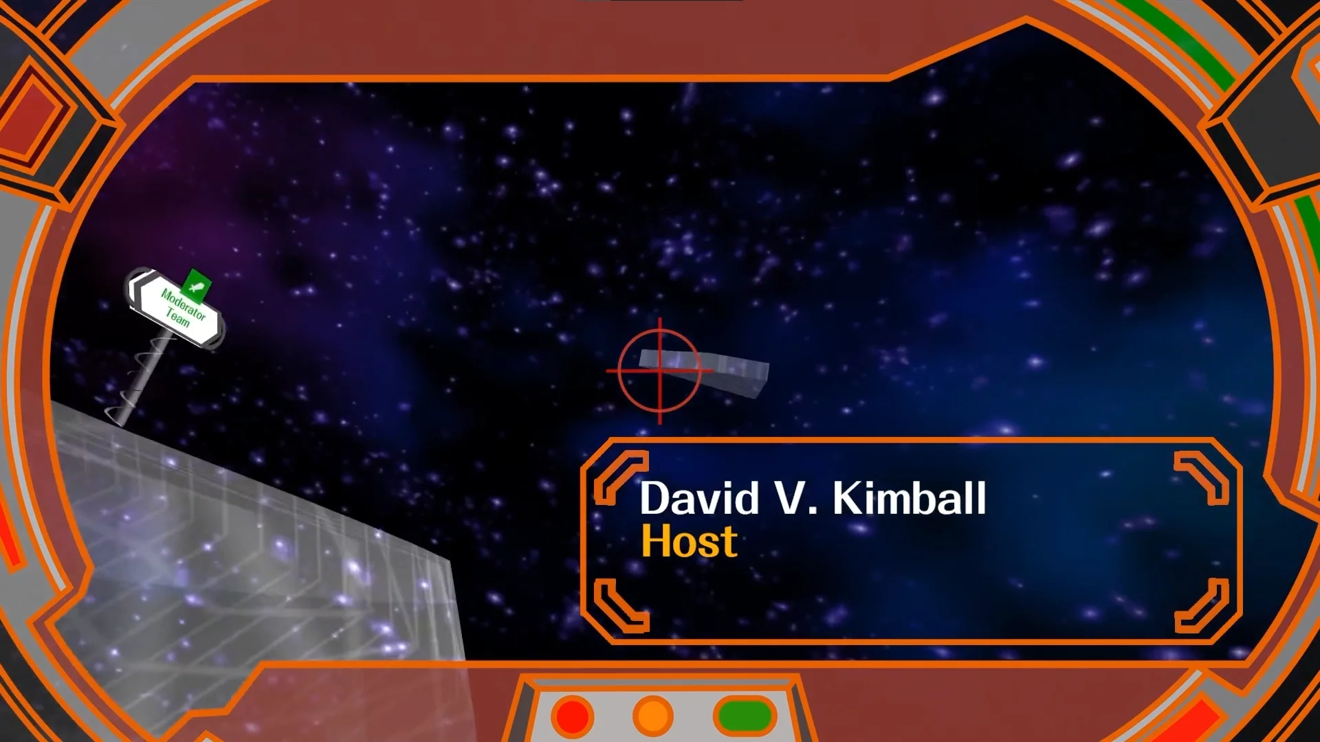
Thanks to WorseDoughnut for creating the widescreen version of the end credits game HUD border!
To achieve this, I removed all the credits through Dolphin texture loading. Then I captured in widescreen at normal speed, and changed the speed in post-production. I also replaced the signs with custom images using the same method.
Older Layout
For fun, I’ve included a video showcasing an older version of this overlay so you can see how it’s progressed in the last 4 years.
This is probably the earliest version of what would become my current overlay. But overtime I got rid of lot of clutter and extra scenes I didn’t need.
Thank you for checking out the details of my Super Smash Bros. Melee-themed overlay, I hope you’ve found this deep dive helpful.
If you’d like to see it yourself, please follow me on Twitch and stop by sometime when I’m live. You can also get alerted in the Discord server when I go live if you so choose.