Analysis of Microsoft's Logo & Design
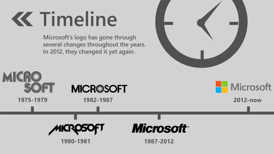
Microsoft’s Current Logo
I created a SlideShare presentation about my interpretation of the design ethos of Microsoft’s logo. Check it out below!
Principles of Modern UI
I also created an analysis of Microsoft’s Design Language, Modern UI.
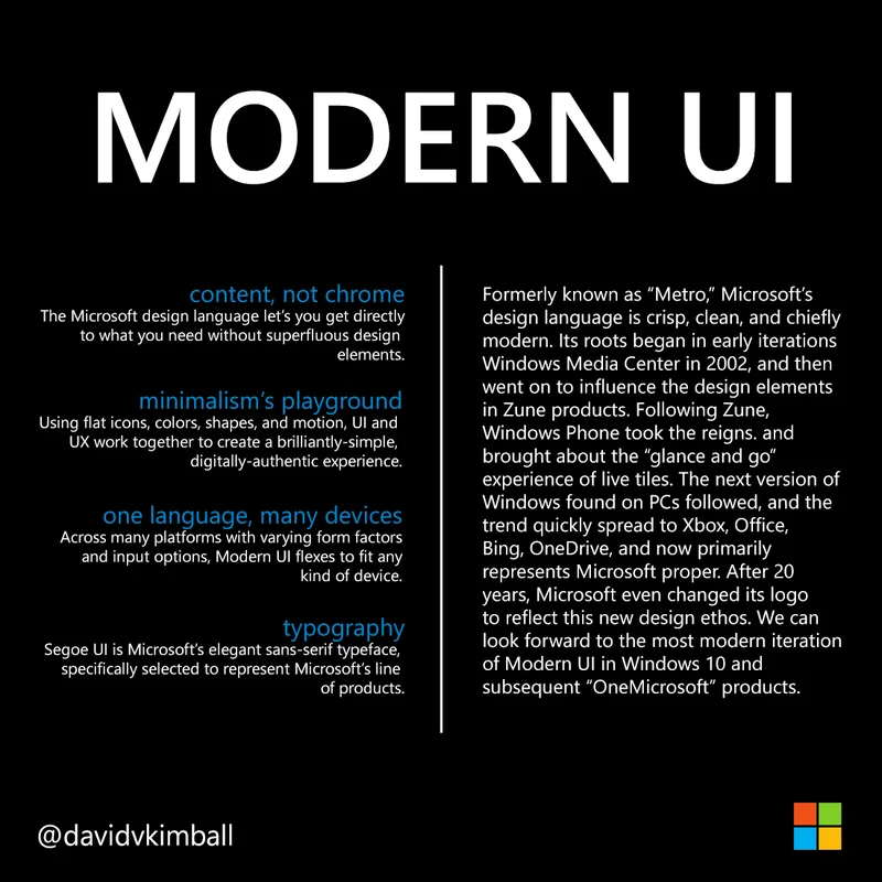 For the most part, something constructed in the Microsoft Design language is built with dark backgrounds and white text in the Segoe UI typeface. The Segoe UI family is a sans-serif font, which is more easily read in the digital medium.
Large type represents the top of a hierarchy of text, such as a heading. Sometimes all caps or all non-caps can be used to represent an identity as an element in the interface, rather than a piece of copy or part of a body of text.
Elements are generally oriented from left-to-right rather than centered, although there can be exceptions.
General guidelines: if you want something to look like the Microsoft design language, think simplicity, iconography, typography, motion, and flatness. Utilize contrasting colors and align margins of elements in the medium so it looks clean and organized.
![]()
Only use movement to enhance the role of the design element, not distract from it. For example, text flipping back and away to make room for new content can convey progression or advancement.
Don’t use gradients, and make sure to use transparency in icons. Don’t grab any old image off of the internet because it will most likely be a picture on a white box. Search for PNG images that support transparency, and pick high resolution images when at all possible.
Use full-sized images to convey effect! They’re worth a thousand words, after all.
When in doubt, strip it down, make it shorter, or simpler. Use simple, flat icons to represent ideas. Be consistent in your arrangement and clear in your visual language.
Remember, the design language is digitally-authentic. This means it is the polar opposite of UX skeuomorphism (a design principle that takes cues from applying a “realism” approach to digital UI by making elements appear or mimic physical, real-world objects or material).
A New Frontier of Interactivity
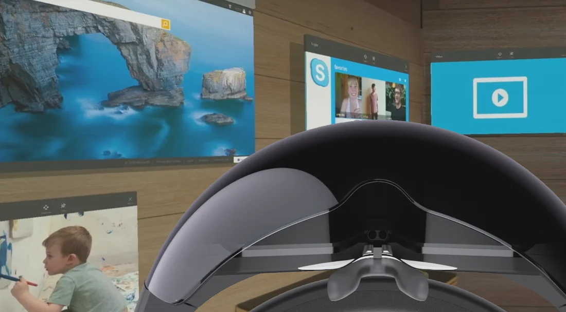
The “new” Microsoft is growing out of its adolescent stage.
Post-Vista Microsoft has been stepping up its game in the consumer space by making authentically-digital software and even entering the world of hardware with Surface and Lumia.
Part of this re-branding was a significant aesthetic shift from glossy icons to flat, minimalist design elements.
A difficult part of this shift was convincing consumers that this change was good.
Some decried Microsoft’s UI and UX change to flatness, simple icons, and minimalism, calling the look “a regression.”
However others championed Microsoft’s new image and celebrated it as the modern look and feel other tech companies ended up mimicking.
Now it seems this UI change has paid off with HoloLens.
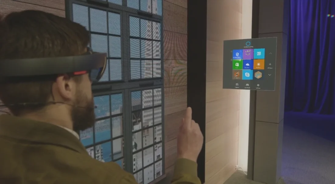
Why? Now the only way to differentiate holograms and scrolling menus and/or floating screens is their perceived depth. Flat icons and menus assist the HoloLens wearer in distinguishing between text and menus from 3D hologram objects.
For example, in this image below shows navigating a flat menu with HoloLens:
And here’s an example of 3D hologram objects existing in a space.
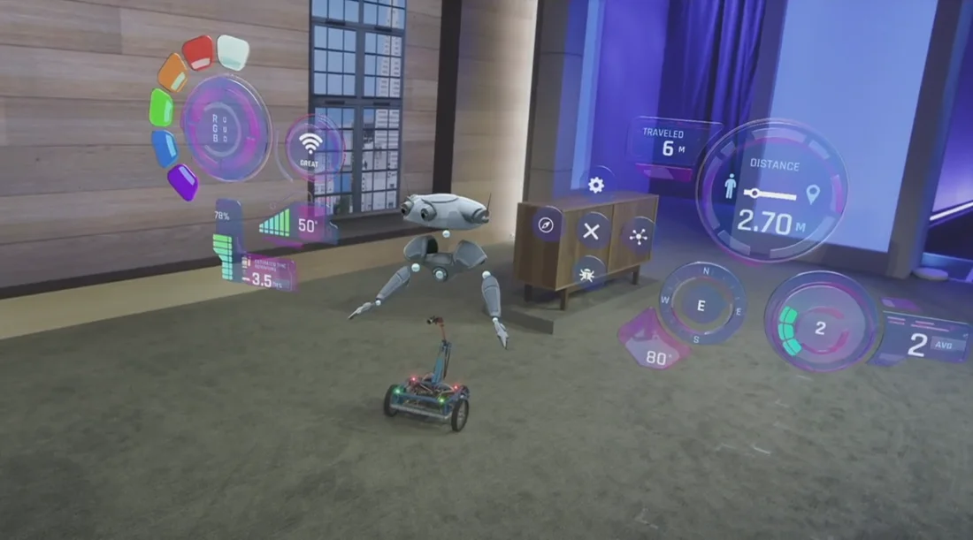
Now flatness can be associated with touch screens and simple hologram menus while 3D UI elements can coexist with 3D holograms and the physical environment.
Tl;DR: Microsoft’s flat design works well with HoloLens because it contrasts beautifully with any 3D hologram elements being projected.
Disclaimer
This is my interpretation of the design language, and does not necessarily reflect any of Microsoft’s thoughts on the matter.